6 UX Design Patterns You Should Know
Tuesday 28 July 2015, by Lewis Swift

Jump to:
What are UX design patterns?
'UX' is short for 'user experience'. So UX design is "the process of enhancing user satisfaction by improving the usability, accessibility, and pleasure provided in the interaction between the user and the product".
UX design patterns are methods for reliably solving user experience problems and improving the way a product (like a website or an app) feels to the user.
These design patterns can be reused (likely with some modification) to address the most common UX concerns quickly and efficiently.
In the same way that a doctor may prescribe the same kind of treatment to all patients experiencing a particular illness, UX designers can refer back to a library of design patterns to help them work more effectively.
Common UX design pattern types include input & output (such as forms and their results), site navigation, content structuring and social sharing.
Below, we'll look at one or two popular UX design patterns for each of these categories.
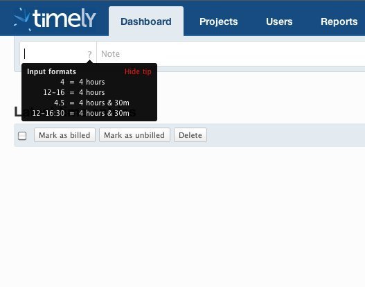
Design Pattern 1: Inline help boxes for forms
Gathering user input on a website or app is esential, for everything from signup and account creation to preference settings.
However, there are still many sites where forms are overly long, behave unexpectedly or are otherwise challenging to complete.
One of the best ways of combating this issue is to implement concise but helpful inline help messages anywhere that users report confusion.
Example
Here, we can see that a small help message appears when the user starts adding values to this input field, making it much easier for them to enter values that will work:
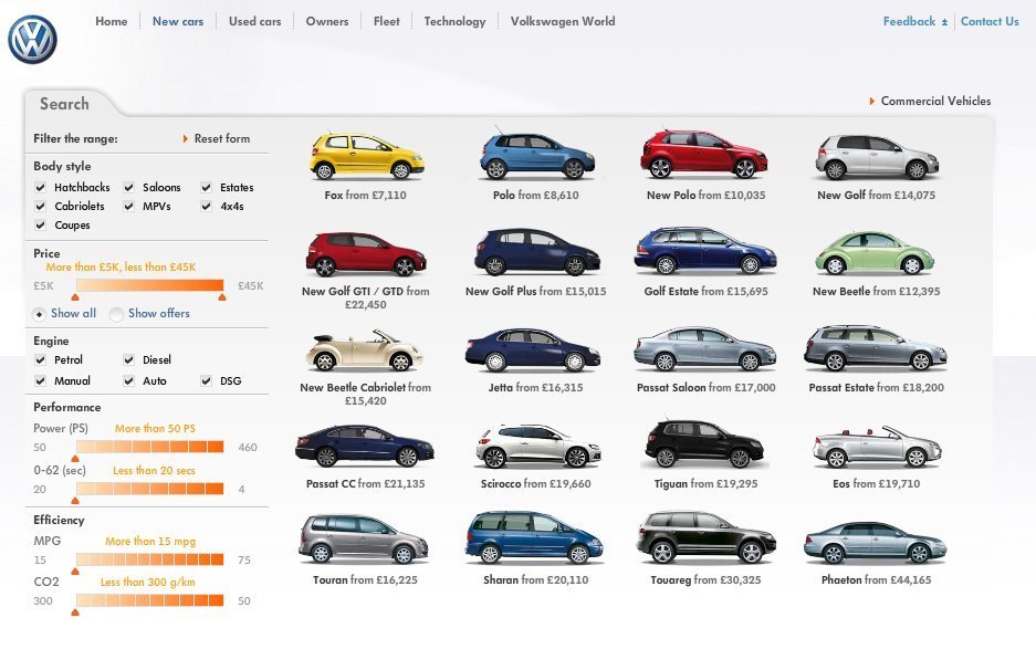
Design Pattern 2: Live data filtering
When presenting the user with data, it's easy to cause them to experience overwhelm and confusion. And this is especially the case when the data set is large.
While this design pattern doesn't necessarily help the user know what to do with the data they're seeing, it can provide them with a helpful first step to take.
In addition, live data filtering is much quicker and more responsive, since the user doesn't need to wait for a new page to load to show their filter results.
This means that users will experience a much more positive overall experience when tackling even large data sets on your website or app.
Example
Volkswagon.co.uk offers live filtering of search results for a more pleasant online shopping experience:
Near the top of a webpage, it's essential to put only the most important content, keeping things minimal so the user knows exactly why they're there and what they should do first.
At the bottom of the page, however, it can be quite a different story.
A user who has scrolled all the way down to the footer is likely keen to learn all about you, your product and/or your company. So at this point, you can give them the extra content they're looking for.
The user may even be looking to learn or do something specific, so the footer is a great place to put quick links to the non-primary actions that they can take on your site.
The 'fat footer' is not appropriate for every situation, but it's a fairly common design pattern across many sites and definitely belongs in your pattern library.
Example
In this example, the Skype website makes it easy for users who don't want to follow the primary call-to-action higher up the page to find their likely alternative goal:
While this design pattern has stirred up some controversy since it became widely-used, it definitely works well when implemented in the right way.
The best time to implement a continuously-scrolling page is when the user should be able to keep reading more content in the easiest way possible. No choices or decision-making, just endless scrolling.
The infinite scroll effect can help keep users engaged for longer, since the effort involved in closing the tab or app may actually feel greater than simply continuing to browse.
On the other hand, navigating to a particular 'page' of infinitely scrolling content is, of course, impossible (especially if the content is custom generated for each user).
Example
The most common use case for this UX design pattern is the social media feed:

Perhaps the opposite of the infinite scroll design pattern is the pagination design pattern.
Instead of loading in new content whenever the user scrolls near the bottom of the page, paginated content sits on separate, clearly-marked pages.
Pagination works best when there is clearly-ordered content which will remain in the expected location. It allows users to jump to a particular section, and to easily return there later (particularly if they bookmark the page).
Example
Google's search results pagination may be the most famous example of this UX design pattern:

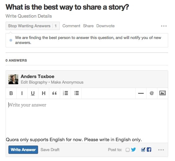
Design Pattern 6: Easy auto-sharing
To encourage the sharing of your content across various social networks, you can build auto-sharing into the flow of your users' activities.
Do be mindful, of course, that in any situation where the content shared might be personal, sensitive or private, auto-sharing features will likely reduce users' trust in your site or app.
But wherever social sharing will make users happy, it can be implemented in ways that make it as easy as ticking a box or tapping a button (with no additional page loads).
Example
On Quora, if you write an answer to another users' question, it's extremely easy to share a link to it on whatever social networks you like: